Visualizing Data In Excel
After attending a very engaging and interesting talk given by Gary Short at Bristol’s DotNetDevNet group, I decided to have a play around with two tools that he showed us for querying and visualizing data in Microsoft Excel.
These tools are Power Query and Power Map for Excel. They are free add-ons for Office 2013 and Office 365. It’s unclear whether they will continue to be available for Office 2013 (currently you can download the previews) or whether they will be only available for Office 365 in the future, so to be on the safe side install them now to have a play around with them.
I’m going to do a quick walkthrough of the demo we were shown by Gary Short at his Introduction to Data Science talk.
First of all we need some data that we can use that will be easy to view in the mapping visualizations; the datasets available at data.police.uk have a perfect type of data for our purposes: types of crimes reported in various locations over time. I selected a year’s worth of data for the “Avon and Somerset Constabulary” and downloaded it to my computer.
The data is given in CSV files; annoyingly with multiple folders each with a single CSV file, and then the bundle zipped for download - so you will need to do a bit of rearranging of files to collect them into a single folder. You can then merge the files using the command line using the command
copy *.csv [[new-filename]].csv
(Remember to remove the duplicate headers from the merged file)
Make sure you have installed Power Query and Power Map, and then open Microsoft Excel and open a new blank workbook. Click the “POWER QUERY” tab in the ribbon, and have a look through the “Get External Data” section. We’re going to be importing data from a file, but as you can see there’s some very interesting options available to us in the “From Other Sources” list, including the option to import from an OData Feed, a SharePoint List, Facebook and Hadoop just to name a few.
Importing data from our merged CSV file is very simple, select “From File” and “From CSV”
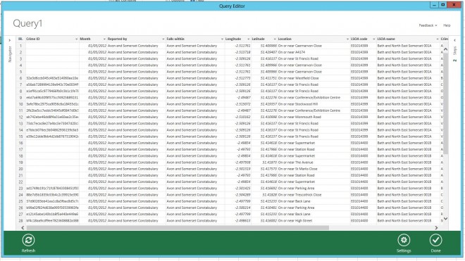
Many of these columns are not needed for our visualizations, so we use this Power Query tool to remove columns that we don’t need, right click on the column header and select “Remove” on Crime ID, Reported By, Falls Within, Location, LSOA Code, LSOA Name and Context. If you want to see the query that has been generated by the tool, then you can click on the Setting button and select “Show Formula Bar”. Then click “Done”. Excel quickly pulls all the data needed using the query into the Excel workbook.
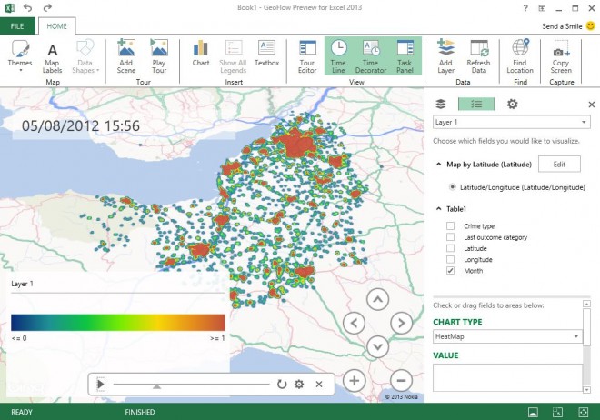
To make use of the second tool mentioned, Power Map, click on the “Insert” tab of the ribbon, and select Launch GeoFlow from the Map button. Select the Latitude and Longitude columns for the geography and then hit “Map It” to load the data onto the map visualization. You can then select “Crime Type” and “Month” to produce visualizations such as this:
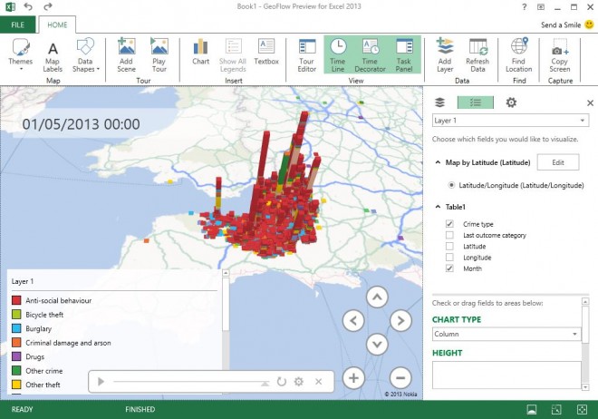
Then just start playing around with the tool to see what you can do! Hit the “play” button to show the data being added over time, or change the Chart Type to show data in a different way.
These new tools from Microsoft really do make merging and querying data extremely easy, and the powerful visualizations from Power Map can be produced quickly and with minimum fuss but incredible results.
The demonstration of these tools was obviously only a tiny segment of Gary Short’s much longer talk on An Introduction to Data Science, so do follow him on twitter or have a look at his blog to find out more. DotNetDevNet hold monthly meetings (although not August) to develop and promote the .NET developers, architects and IT pros of Bristol and the South West. Have a look at their website to see the wide range of interesting topics that are covered by guest speakers at each event and to register for future meetings and updates.