Loading data from SPARQL Endpoints into Excel Power Map
Following on from the previous post about Visualizing data in Excel, I decided to have a look at how easy it would be to load data from a SPARQL endpoint into an Excel Power Map.
SPARQL 1.1 supports a return format of CSV, which makes it straightforward to write a query that returns a useful set of data to load into Excel.
DBpedia has various resources that contain longitude and latitude data, and has a very handy SPARQL endpoint complete with query editor, so the first thing to do is to write a query to return data that shows people’s birth places over time.
Writing the query
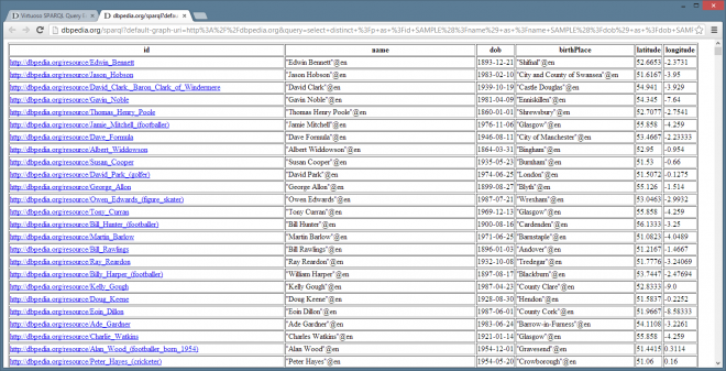
Load the DBpedia SPARQL Query Editor in your browser, and set the results format to HTML. This will display the results in the same webpage in an HTML tabular format so that you can adjust your query before downloading any CSV. Enter the SPARQL shown below into the Query Text field.
select distinct ?p ?name ?dob ?birthPlace ?lat ?long where {

?p a dbpedia-owl:Person .

?p foaf:name ?name .

?p dbpedia-owl:birthDate ?dob .

?p dbpedia-owl:birthPlace ?bp .

?bp a dbpedia-owl:Settlement .

?bp foaf:name ?birthPlace .

?bp geo:lat ?lat .

?bp geo:long ?long .

}

LIMIT 250
This returns resources of type dbpedia-owl:Person whose birth place was of type dbpedia-owl:Settlement (to narrow down the birth place to as specific an area as possible). The query also returns the name and date of birth of the person, and latitude, longitude and name of the birth place.
Viewing this in the browser we can see a number of duplicates, and for the purposes of this example we’ll narrow the data to those in the UK and the Republic of Ireland. To do this, amend the query to the following:
select distinct ?p as ?id SAMPLE(?name) as ?name SAMPLE(?dob) as ?dob SAMPLE(?birthPlace) as ?birthPlace SAMPLE(?lat) as ?latitude SAMPLE(?long) as ?longitude

where {

?p a dbpedia-owl:Person .

?p foaf:name ?name .

?p dbpedia-owl:birthDate ?dob .

?p dbpedia-owl:birthPlace ?bp .

?bp a dbpedia-owl:Settlement .

?p dbpedia-owl:birthPlace ?bp2 .

{ ?bp2 dbpedia-owl:country dbpedia:United_Kingdom } UNION { ?bp2 dbpedia-owl:country dbpedia:Republic_of_Ireland } .

?bp foaf:name ?birthPlace .

?bp geo:lat ?lat .

?bp geo:long ?long . }

GROUP BY ?p

LIMIT 1000
Click “Run Query” to check the results, and then up the LIMIT to 250000 and set the Results Format to CSV. This will download a file named “sparql” to your computer. Go to the downloaded file and rename it to dbpedia_personbirth.csv.
Loading and viewing the data
Before opening Excel, make sure you have installed Power Query and Power Map as explained in the previous blog post.
Open Excel, click the Power Query tab and select Import > From File > CSV and open dbpedia_personbirth.csv in the Query Editor.
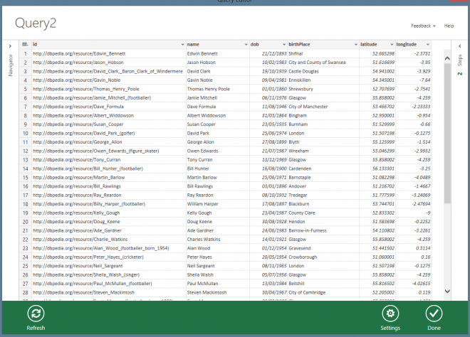
Our SPARQL query was very selective when returning variables, so we don’t need to remove any columns from the import query, so click “Done”.
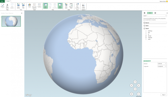
Wait for the data to load completely, and then click “Load to Data Model” in the Query Settings section, after this is complete, open the Insert tab and hit the GeoFlow > Map > Launch GeoFlow. This launches a new Power Map Tour window, and clicking on the latitude and longitude columns autofills the options in the “Geography” section ready to hit “Map It”
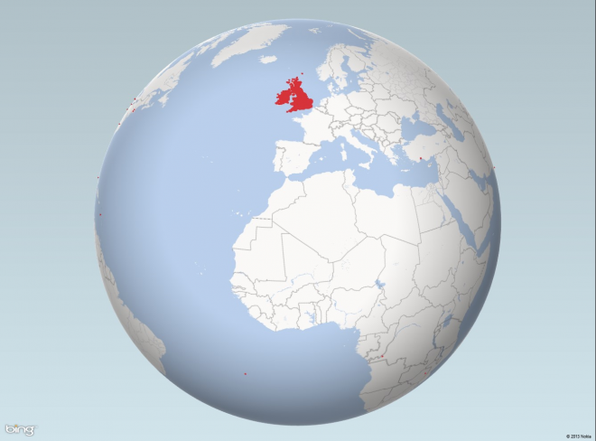
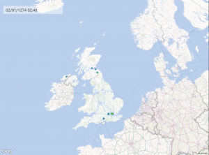
Once the data has been mapped we can see some strange data, namely the points of red over in the USA and elsewhere on the globe (shown below); very strange considering the data was filtered to the UK and Ireland! But we’ll come back to that later as we can see that the majority of the data is indeed on the British Isles.
Now that the data is mapped, select dob which is entered into the “Time” field and then change the Chart Type to “HeatMap”.
As Power Query recognises that the dob field contains dates, it converts them to Date types in the Excel workbook. Power Map in turn recognises the date fields, and when it is selected loads the field into “Time” - this also displays a floating date display over the map, and adds playback controls to the bottom of the screen.
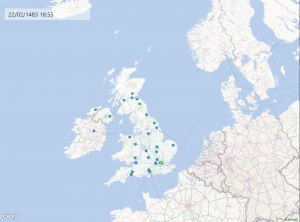
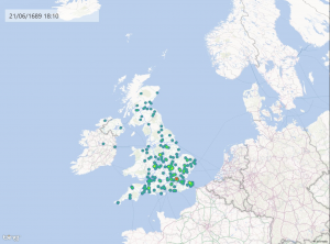
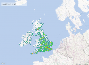
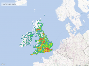
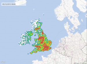
Press the Play button to start the data visualization and you will see the map changing over time as pinpoints are added to the heatmap as the data loads another person’s date of birth, and adds the location of their birth place to the map (as shown in the screenshots below).
Following the steps above shows how you can easily query data from a SPARQL endpoint, and then quickly load and manipulate the data (if required) using Excel Power Query, and then view that data using Excel Power Map.
Investigating Strange Data
As mentioned above, when the data was first loaded into Power Map - we can see some pinpoints outside of the UK, which are not expected given that the query is written to filter down to only UK results. To check out these pin points of confusing data, we can load the id field on the Power Map. Loading every ID slows down the visualization tool significantly, but is worth doing for investigation into the the odds lines of data. Zooming in on a pin point in the USA and clicking on the pin point (when the chart type is set to “Column”) displays the information of that point, and we can type the ID shown directly into our browser to load up the page in DBpedia.
For example, one of the points of “bad data” near Chicago shows the id
http://dbpedia.org/page/Bill_Brennan
Loading this up in the browser shows that Bill Brennan has multiple possible birth places of Chicago, and County Mayo, Ireland. This may simply be that the person’s birth place is not actually known.
Clicking on the point of data with the earliest birth date is surprising, as instead of showing a Roman Emporer or similar, instead the ID was shown for Chris Smalling. Going to the resource page for Chris Smalling shows his birth data as 22nd November 0198. An obvious data entry/clean up error as the dbpprop property shows the birth date as 22nd Nov 1989.
This shows how loading data into a visualization tool can help us spot “bad” data very quickly and investigate it, without having to read hundreds of lines of text on a spreadsheet.
Troubleshooting dates in Power Map
Whilst writing this blog post I had trouble replicating the stages of loading the data into the Power Map as there was a problem with the dob field. Excel Power Query was not converting any dates with a year previous to 1900 properly for use in the playback Time field in the visualization. The solution to this problem was to click the Load to Data Model option after the data had initially loaded from the CSV file, and before loading the data to a Power Map. The post above has been updated to include this step.